Client
Ludzie i Medycyna Foundation
Country
Poland
Type
Team project
Duration
Mar 2026 - Present
The Ludzie i Medycyna Foundation is an NGO focused on the psychosocial aspects of living with illness, creating solutions for people with chronic conditions.

"Ludzie i Medycyna" translates to "People and Medicine". The Foundation’s name embodies its mission to improve patients’ experiences and help them live as well as possible with illness, while emphasizing its patient-centered approach.
Project Overview
Setting the stage. The website is developed by volunteers at the People and Medicine Foundation, where I support its ongoing improvement as part of the UX/UI team. I joined the project during the preparation phase for the redesign, which I am currently working on.

Problems
Lack of a consistent visual identity and brand experience across the Foundation’s digital presence, including its website, social media, podcasts and other online publications.
Unclear communication about the Foundation’s commercial offering and opportunities for business collaboration in the For Business section.

Goals
To define redesign guidelines, including a brand book for the Foundation, and align the website and other digital publications with these principles.
To refresh the For Business section and clarify the Foundation’s commercial offering to more effectively encourage companies to support our initiatives, engage in joint projects, and provide funding for our ongoing activities.

My role
Volunteer, UX Researcher, UX/UI Designer, Team member

Responsibilities
Evaluating the website’s current design and functionality
Analyzing the visual communication language across all of the Foundation’s digital materials
Developing a strategy for generating revenue for the Foundation through its commercial offering
Benchmarking competitors in terms of the Foundation’s commercial offering
Cooperating with team members and other volunteers
Participating in the Foundation's design reviews
For Business
How to attract partners? We started by exploring how to communicate with businesses most effectively through the website. We conducted a competitive analysis to understand how other foundations present their commercial offerings and where our Foundation stands in comparison.

Current design


Competitive analysis
We identified our competitors as foundations operating in the health, UX and technology spaces. We analyzed them based on:
What they focus on and what activities they undertake
Who their offering is aimed at and what they offer to business partners
Which partners they collaborate with
To compare the organizations we looked at the following parameters:
Number of commercial services offered
Number of pages dedicated to commercial services
Social media reach across Facebook, Instagram and YouTube
Collaborations with experts and influencers
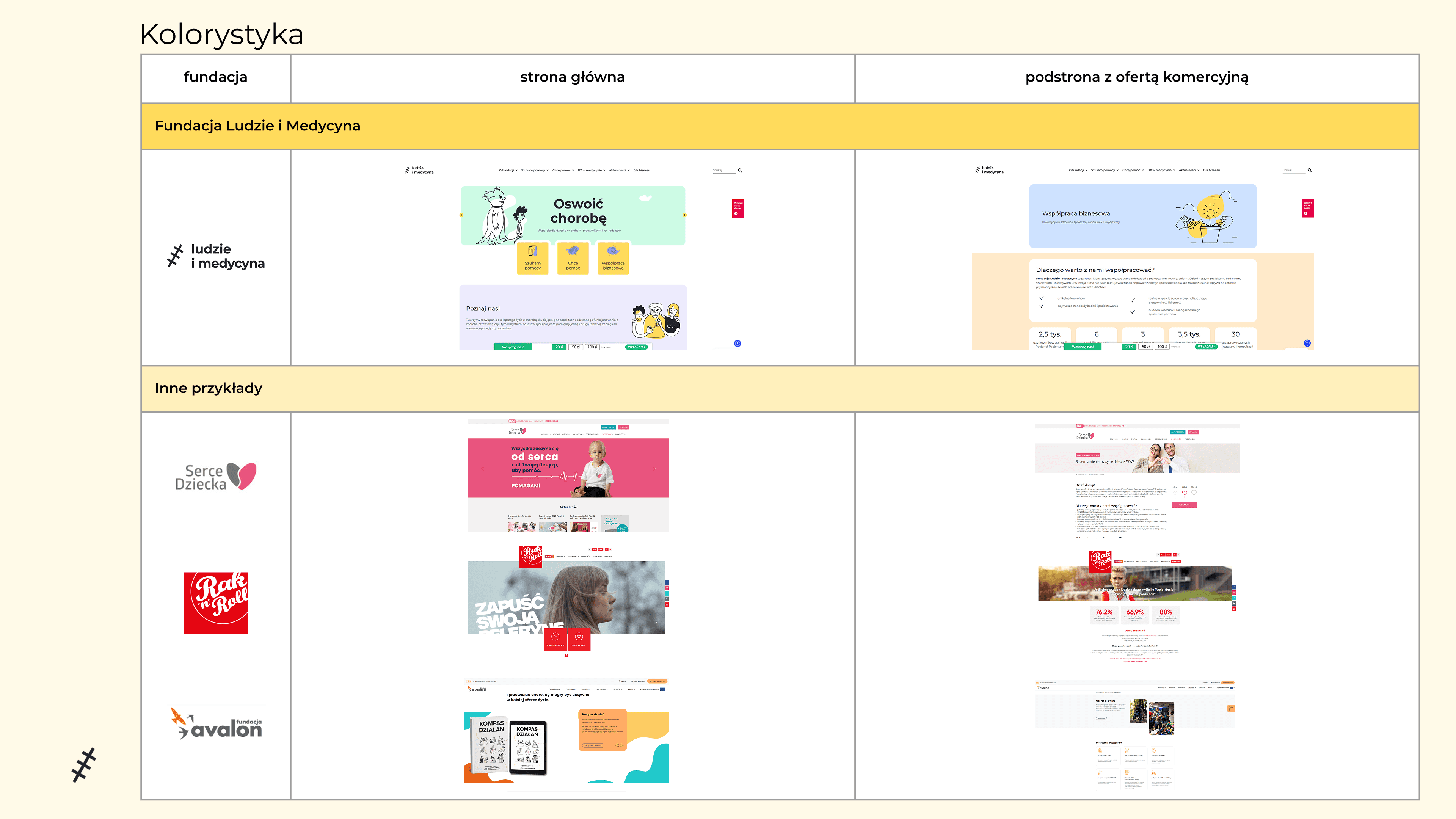
Visual language and color palette of the homepage and the page dedicated to business partners



Key findings
Variety of offerings
Most foundations offer one commercial service or a set of services — typically training sessions or workshops with a similar purpose and focus. In contrast, our Foundation offers both UX research and design services as well as workshops and training for businesses, including participatory workshops and health-focused sessions.
Number of subpages
Foundations typically present each service they offer, such as a specific type of workshop, on a separate subpage, unlike our Foundation, where a broad range of services is presented on a single page.
Visual style
The business offering page is typically visually distinct from the rest of the foundation’s website. It often features a darker color palette and a more “business-oriented” feel. Our Foundation’s For Business page shares the same pastel color palette and visual character as the homepage and other subpages.
Next Steps
What's next? We are still collecting and analyzing data to extract the most valuable design insights for the website redesign with a particular focus on the For Business section and its related goals.

Website redesign
New design principles. We are looking for examples of style guides and storybooks of other brands, focusing on dos and don’ts and collecting them in Miro to help define our redesign principles and shape the Foundation’s brand direction.
Interviews and workshop. We are planning interviews and workshop for the Foundation’s volunteers focused on its brand and visual identity, which will help us gain insights from different perspectives.

For Business
Design insights. We are formulating design insights based on the information gathered through our research and competitive analysis, which will guide us in redesigning the For Business section.
Business potential. We are preparing a survey for the Foundation’s volunteers to help us map what we can offer potential business partners and what benefits such partnerships could bring them. Through the survey, we want to identify our strongest assets and use them as a basis for creating a clear and compelling commercial offering.
The redesign is still in progress and this case study will evolve alongside the project. In the meantime, you can explore the current version of the Foundation’s website.
