Client
SWPS University
Country
Poland
Type
Team project
Timeline
Oct 2025 - Jun 2026
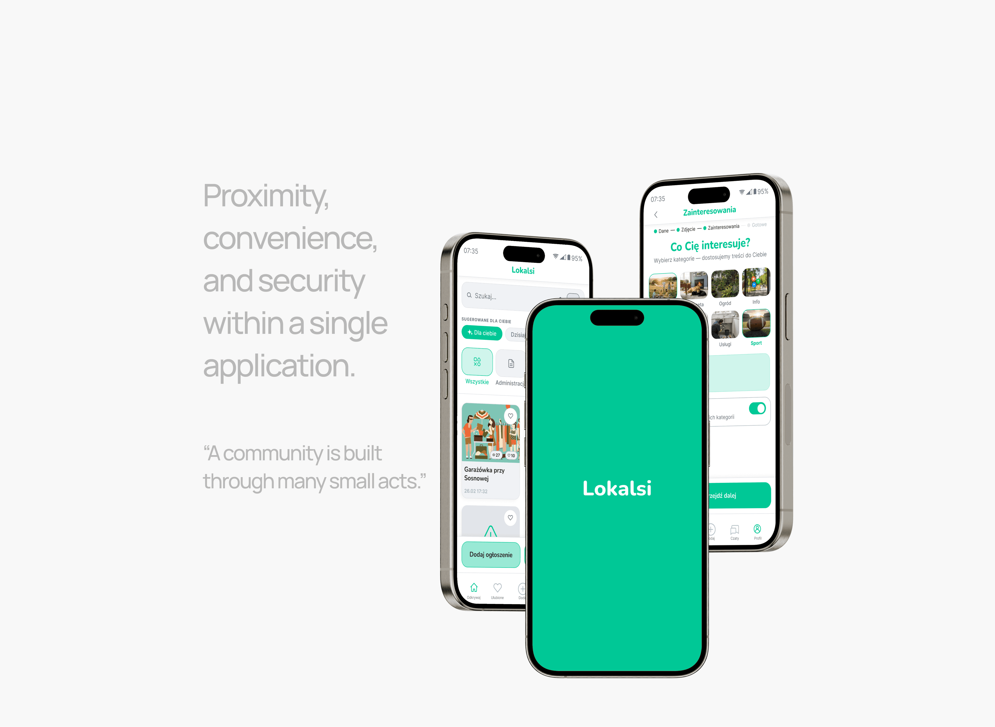
Neighborhood mobile app that connects residents to share services, resources and local information, helping them build a trusted community.

"Lokalsi" comes from the Polish informal word "lokalsi", meaning locals — people who live in the same area or neighborhood. The name reflects the app’s purpose: bringing residents together and fostering local connections.
Project Overview
How it all started? Lokalsi is a collaborative diploma project completed as part of a one-year postgraduate UX Design / Product Design program at SWPS University. The project topic was independently conceived and developed by our five-person team, following the complete Design Thinking process — from research and ideation to prototyping and validation.
Project idea
To make it easier for residents of large housing estates to build and maintain neighborly relationships, especially for those who feel anonymous and seek authentic connections with the people around them.
To strengthen the sense of belonging within the local community, reduce anonymity, and help residents feel safer while fostering mutual trust.
My role
Student, UX Researcher, UX/UI and Product Designer, Team member
Responsibilities
Conducting user interviews and desk research
Defining product strategy
Designing UX and UI from wireframes to interactive prototypes
Executing usability testing and refining design concepts
Participating in design reviews with mentors
Presenting the product pitch to an evaluation panel
Collaborating with team members

UX Research
We took a deeper dive… by conducting desk research and 10 in-depth interviews with representatives of the target group. This enabled us to identify key user needs and uncover the most important insights that shaped the project's direction.
79% of polish households are located in multi-family residential buildings. emergencies — despite living in close proximity. [1]
83% of residents in polish housing estates only greet their neighbors with most interactions remaining superficial. [2]
84,8% of respondents identified mutual support as one of the main benefits of having good relationships with their neighbors. [3]
Pain points
High anonymity and resident turnover are the main barriers to building a sense of community, exchanging help, and relying on neighbors in emergencies — despite living in close proximity.
Chaos, spam, information overload, lack of user verification, and fragmented communication tools create uncertainty and frustration on popular communication platforms.
Key insights
Practical support
The most commonly expressed need was practical, everyday support rather than social relationships, motivating people to collaborate with one another.
Connections along the way
Solutions designed to foster neighborhood connections should not force social interaction, but rather facilitate the exchange of services and information.
Building trust
Knowing one’s neighbors — even just by name — contributes to a greater sense of safety and security while reducing the feeling of anonymity.
Target group
To better understand the target audience, we created two personas representing the product's key user segments.
Apartment building residents who seek to reduce the feeling of anonymity and strengthen their sense of belonging.
Townhouse residents who need a practical tool for effectively managing their residential community and organizing shared leisure activities.


Housing Conditions in Poland According to the Results of the National Population and Housing Census 2021. GUS. Warszawa, Lublin 2023
Contacts with Neighbours and Other Social Ties. CBOS BS/93/2012. Warszawa, 2012
Neighborhood and E-Neighborhood. The Case of Kraków. Joanna Grzechnik, Agnieszka Hess, Roksana Gloc, Joanna Najbor. Kraków 2023
UX Strategy
How did we turn insights into a strategy? In response to the identified needs and pain points of housing estate residents, we decided to design a mobile application that provides a safe space for verified community members to exchange services, resources, and local information within their neighborhood.
Unique Selling Point
Proximity
Leveraging residents' real-life proximity to increase the effectiveness of neighbor-to-neighbor assistance and resource sharing.
Convenience
Consolidating key functionalities within a single application to minimize the need to switch between multiple tools and reduce cognitive load.
Security
Ensuring interactions take place within a closed, verified community, increasing trust and encouraging mutual support among residents.


Smartphones are almost always within users’ reach, making them the most suitable touchpoint for this product.
Mobile app aligns with the project's purpose by providing instant, on-the-go access, supporting multitasking and allowing users to benefit from the product's value whenever they need it.
Business model & future growth
MVP
The property management purchases a B2B subscription and provides the app to all residents. The cost of using the app is included in residents' maintenance fees.
KPIs we decided to measure
Effectiveness: number of resolved requests/issues, time required to resolve a request/issue.
User activation: number of activated accounts.
Initial engagement: number of users who completed a key action, number of new listings created.
Future development opportunities
Integration of a payment gateway
Paid promotion of listings
Transaction fees
Ads supporting local businesses
Additional features for property management including remote voting and rent and utility billing


Product Modeling
What should the product do? At this stage, our goal was to define the application's core features that encourage user interaction by making it easy for residents to connect, solve everyday needs together, and build a trusted community, as well as the information architecture that highlights the app's main values.
Core features
User verification and personalization
Recognizing neighbors within the app reduces anonymity and builds a sense of safety, while profile personalization enables better matching of listings.
Administrative notice board
Providing convenient access to administrative announcements, simplifying communication with property management, and enabling quick issue reporting.
Neighborhood marketplace
Simplify the buying and selling process, increase the chances of quick transactions, save time on packaging and shipping and help neighbors get to know each other naturally.
Community initiatives
Building practical relationships through favor exchange, developing trust among neighbors, and creating a local support network, enabled by residents' proximity.
Interest groups
Helping people with shared interests make the first connection, enabling them to co-create community activities, and fostering a stronger sense of belonging within the neighborhood.
Local event discovery
Enabling ticket booking, increasing access to local activities, keeping residents up to date with neighborhood life, increasing their engagement, and supporting local businesses.
Information architecture
To define the information architecture, we identified five key product use scenarios and visualized them through corresponding user flows and low-fidelity paper wireflows.
User flows helped us design the application's structure and define how it works.
Wireflows enabled us to visualize the interface and ensure consistency across screens.


Prototyping
How did we bring the idea to life? In this step we designed high-fidelity mockups for all the app screens, ensuring consistency in typography, color, and iconography throughout the product. Then we connected them to create the first version of the app's interactive prototype.
Mockups
First we used Figma to create digital wireframes for all the screens illustrating the five key product use scenarios. To ensure consistency and an efficient workflow, we created a design system with the essential UI components and interface elements.

Interactive prototype
Next we transformed the static mockups into the first interactive prototype of the application. We wanted to show how all the screens and components interact with each other.

Usability Testing
It was time to validate the product concept. To evaluate the usability of our application we conducted 10 moderated usability tests with representatives of the target group. As a result, we could implement design improvements based on user feedback and our observations.
Refining design
During the usability tests, users completed tasks based on the key product scenarios. This allowed us to identify the main challenges and usability issues they encountered and to implement design improvements.
Unclear user verification process -> Replaced QR code scanning with verification via a link sent by the property management in an email
Misleading chat icon in the bottom navigation -> Replaced the envelope icon with a chat bubbles icon
Unintuitive location of interest groups -> Moved interest groups from the Chats section to Initiatives
Poor visibility of the option to add photos to listings -> Redesigned the image upload tiles to make the feature more noticeable

Final Design
Finally, we were ready to present the final solution. This gave us an opportunity to reflect on our design process, evaluate the product we created, and identify key learnings to apply in future projects.
High-fidelity prototype
This is the detailed, interactive version of our design after implementing the improvements, helping enhance the user experience and increase the app's usability. Let's explore the main flows of Lokalsi!

Onboarding
Issue reporting
Posting a listing

Joining an initiative
Creating a group
Ticket booking
Project Learnings
What did I learn from working on this project? This project gave me the chance to experience every stage of the design process step by step. It allowed me to explore each phase in depth and understand how the decisions and insights gained at one stage influence the next, ultimately shaping the final product.
Takeaways
Things I learned
Value of teamwork. I strengthened my collaboration skills through shared analysis, collective decision-making and giving and receiving constructive feedback.
Project pitching. I improved my presentation skills and gained confidence in communicating and defending my design decisions.
Figma. I developed my Figma skills by designing high-fidelity interfaces and building a design system from scratch.
Reflections
Delivering value. I learned that valuable products are created by solving real user problems rather than relying on assumptions.
Thinking outside the box. I came to understand that meaningful research insights and well-drawn conclusions are the foundation of effective design decisions.
Differents points of view. I discovered how differently users can perceive the same product, reinforcing the importance of validating assumptions through user testing.
Looking back, I would…
Iterations make it better. Conduct another round of usability testing to ensure the changes made the app more intuitive and easier to use.
Play and esperimentation matter. Experiment with the information architecture to explore alternative ways of presenting the administration and issue reporting section.
IBM Challenge
Lokalsi was submitted to the IBM Innovation Project — Country Challenge 2026. We explored how AI could support a solution addressing local community needs. As part of the challenge we enhanced the app concept with AI-powered features designed to improve the user experience and help residents build stronger local connections.
About the challenge
What is IBM Innovation Project?
It is an initiative for students, who want to develop projects that address significant social or business challenges by leveraging artificial intelligence and IBM technologies.
Formal requirements
The project must leverage artificial intelligence including generative AI technologies.
The project must address a significant social or business challenge.
The team must hold at least four IBM Digital Credentials earned through IBM SkillsBuild courses.


AI integration summary
Our solution
We presented our solution by expanding the original Lokalsi concept with intelligent features that responded to user needs identified during the research phase and refined the overall product experience, demonstrating how they help deliver the product’s value to users.
How AI improved the UX
Transformed the app from a passive tool into a proactive AI assistant by:
Increasing efficiency by automating repetitive tasks and reducing manual input.
Enhancing personalization through intelligent recommendations and smart neighborhood matching.
Improving discoverability by helping users find relevant people, services and local initiatives faster.
Reducing cognitive load by summarizing conversations and suggesting next actions.
Strengthening trust and safety through user verification, fraud detection, secure communication and content moderation.